Unifying a Fragmented Telecom SaaS Ecosystem
The problem
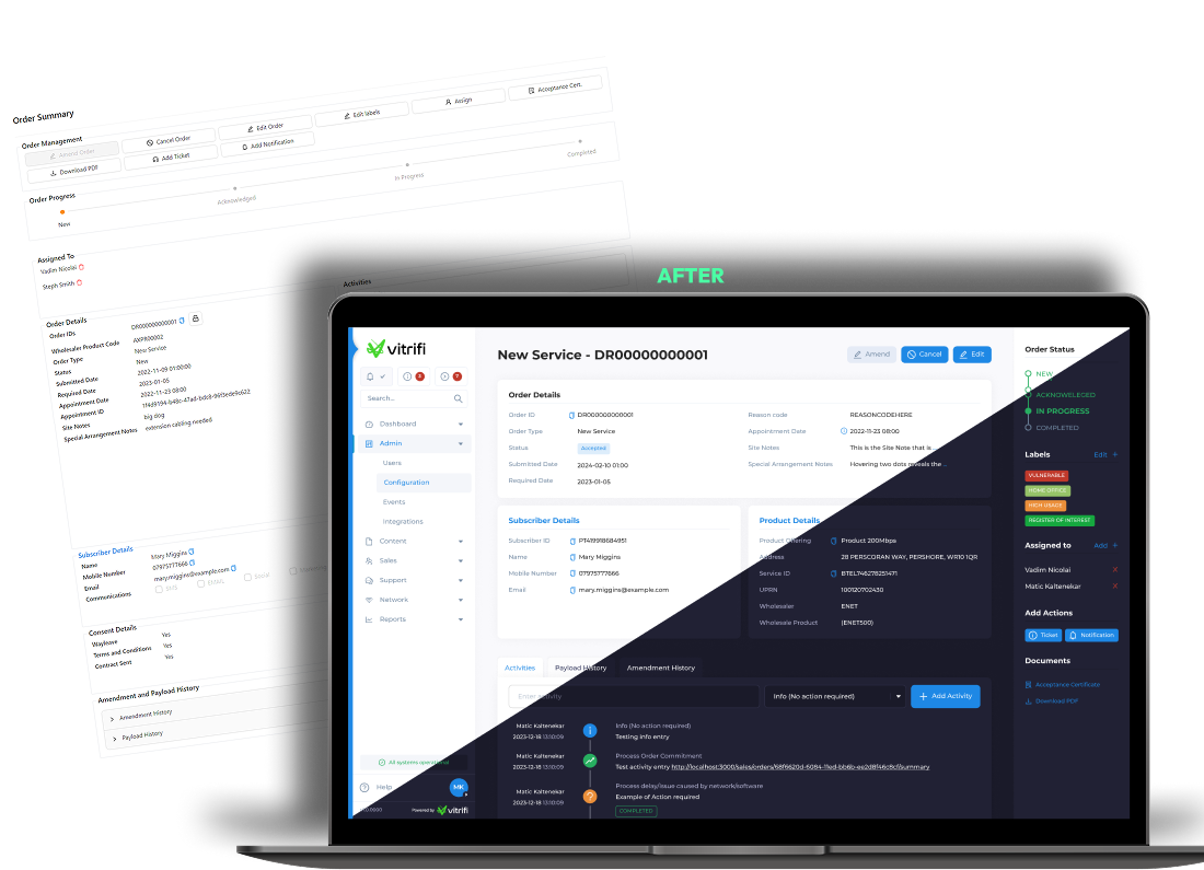
The Vitrifi platform consisted of multiple independently developed applications created without a unified UX strategy.
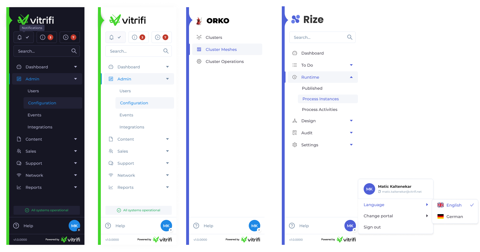
As a result, several issues emerged:- Inconsistent UI patterns across products
- Different navigation structures in each platform
- Complex workflows requiring unnecessary steps
- Overloaded interfaces with too many competing visual elements
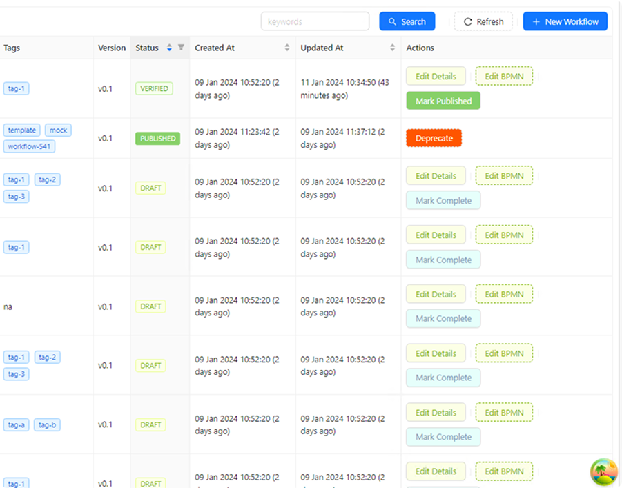
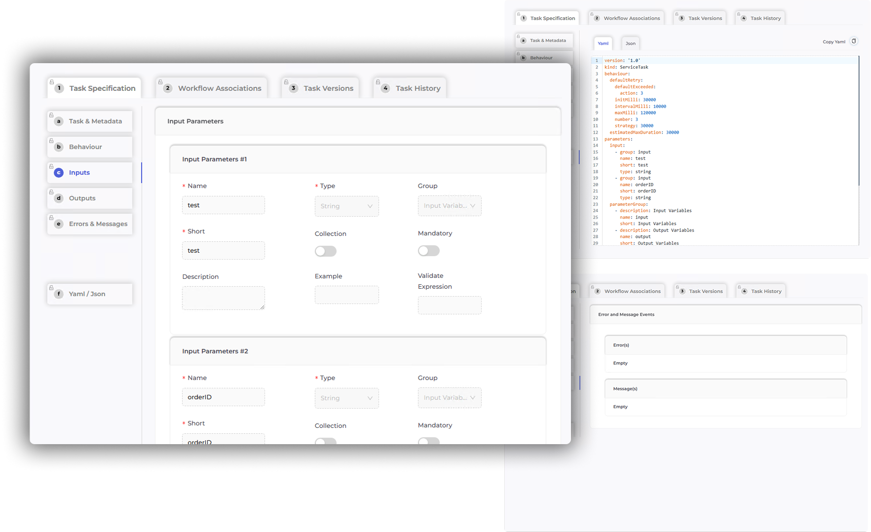
- Forms and data entry processes that were difficult to understand
Because each product was built by a different team, the ecosystem behaved more like separate tools rather than a unified platform.
Users
The platform was designed for telecommunications operators and internal operational teams responsible for managing telecom infrastructure and services.
Typical users included:- Network Operations Teams
- Service Provisioning Specialists
- Operations Managers
- Customer Operations Teams
These users typically work in high-complexity operational environments, where efficiency and clarity are critical because their actions directly affect service delivery.
Constraints
The project involved several significant constraints:
- Existing product already developed
The platform was largely built, so major structural changes were limited.
- Minimal code changes required
UX improvements needed to rely mostly on interface, hierarchy, and interaction improvements rather than backend restructuring.
- Multiple independent development teams
Each product had its own engineering team and existing UI components.
- Different product scopes
The platform included several modules serving different use cases but still needed to feel like one cohesive ecosystem.
These constraints required a design strategy focused on harmonization rather than rebuilding.
Approach
To understand the current state of the platform and identify opportunities for improvement, I conducted a structured UX evaluation.
Aligned with product owners and stakeholders to understand business goals, product vision, and key operational workflows.
Evaluated the existing platform ecosystem to identify usability issues, inconsistent patterns, and workflow friction.
Analyzed comparable enterprise platforms to identify industry patterns and best practices for complex SaaS interfaces.
Mapped key user workflows to uncover friction points and opportunities to simplify common tasks.
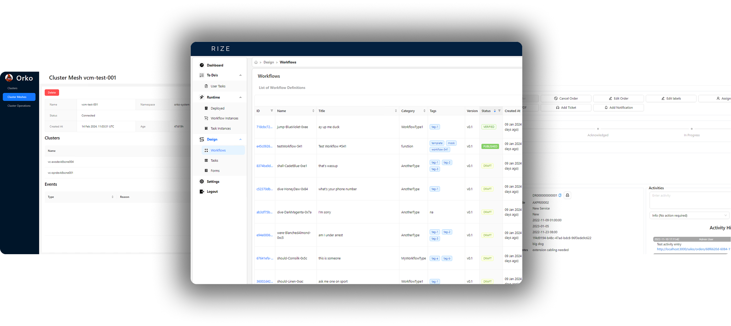
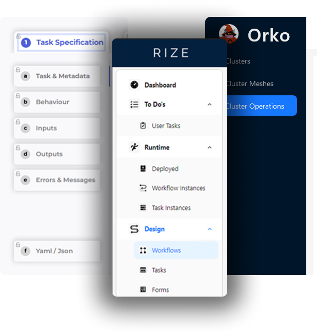
Reviewed existing UI components across products to identify reusable patterns and opportunities for standardization.
Restructured the navigation and content hierarchy to better reflect how users perform their tasks.
Created interactive prototypes to validate improved workflows and communicate design solutions to development teams.
Collaborated with multiple product teams to ensure consistent UX patterns and design system adoption across the platform.
Key Insights
The UX audit revealed several structural issues across the ecosystem:
The Solution
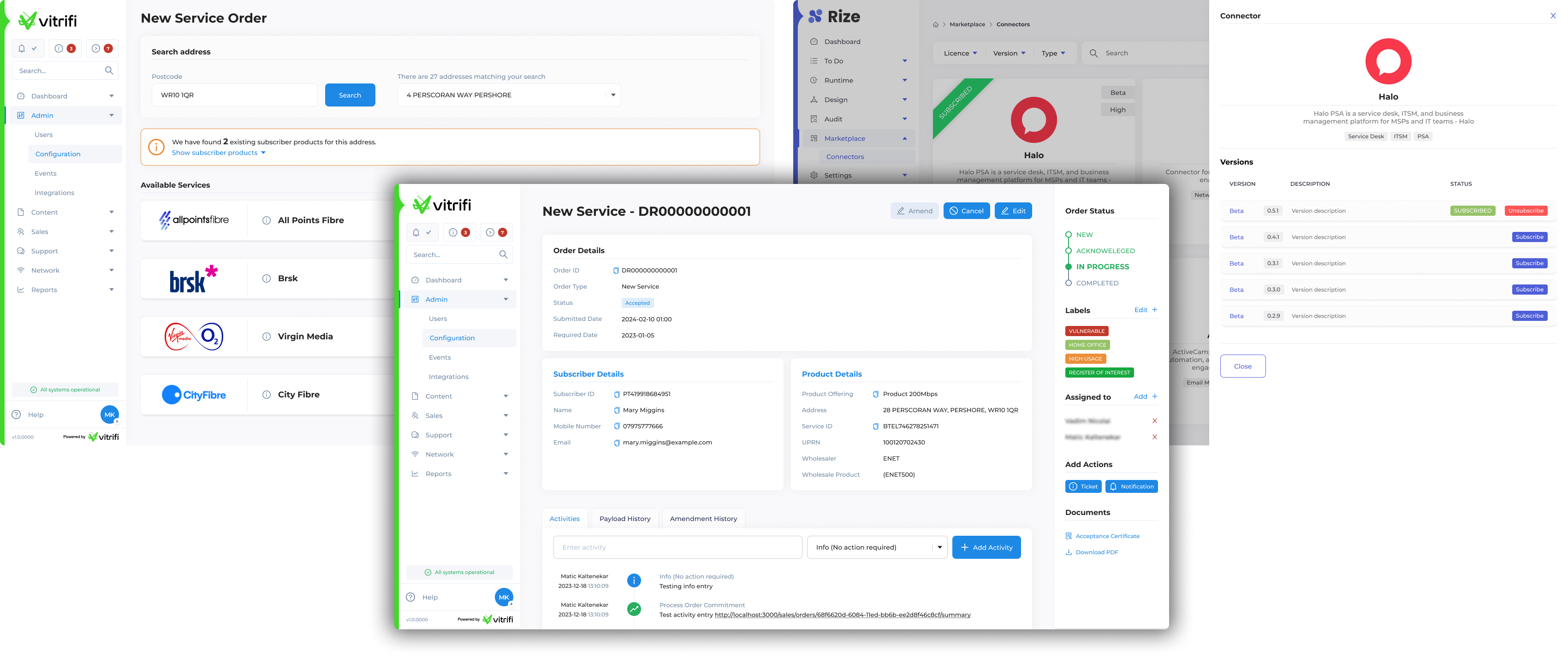
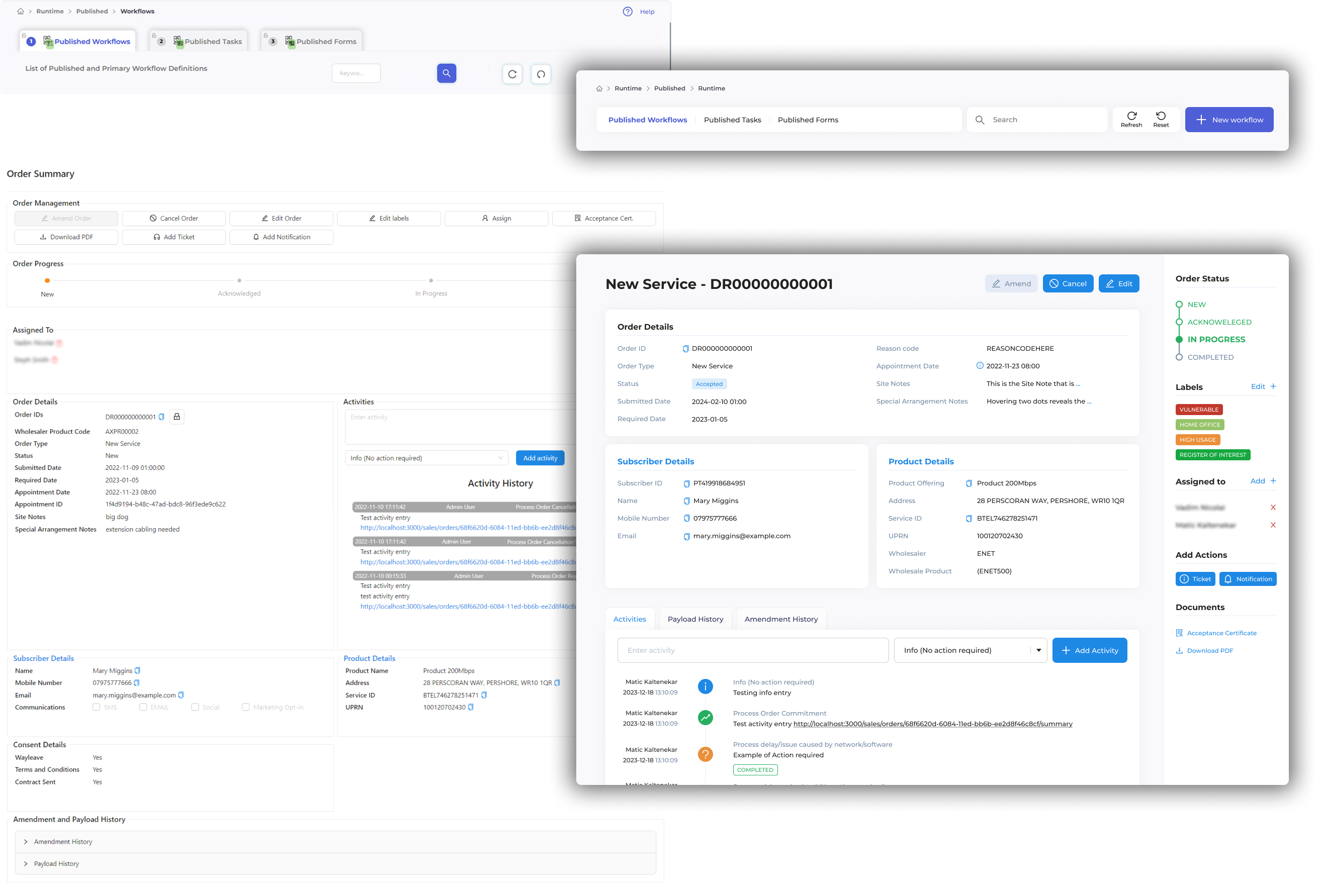
Unified Navigation
I designed a consistent navigation structure that could be applied across all platform modules.
This improved:- orientation
- task discovery
- cross-product consistency
Improved Information Architecture
The content structure was reorganized to reflect how users actually perform their tasks, reducing unnecessary navigation steps.
Interface Simplification
Interfaces were simplified by:- removing redundant UI elements
- prioritizing key actions
- reducing competing visual elements
This created a clearer visual hierarchy and faster task recognition.
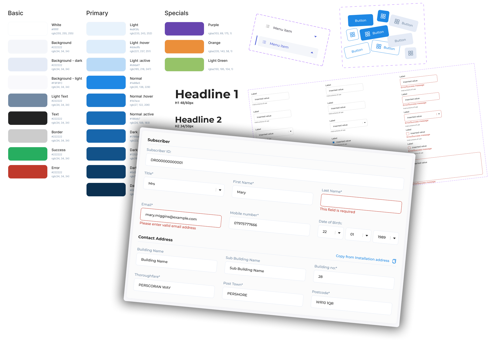
Design System
To ensure long-term consistency across teams, I introduced a shared component system.
This included:- reusable UI components
- consistent interaction patterns
- standardized layouts
- shared visual language
This allowed different engineering teams to build features while maintaining a unified user experience.
The Result
Internal prototype testing and stakeholder validation showed significant improvements in usability and task clarity.
Expected improvements included:
- Reduced workflow steps across key tasks
- Improved navigation clarity across platform modules
- Estimated 30–40% faster task completion based on internal usability testing